Aug 11, 2015 Straightsell
The Straightsell shared server environment receives tens of millions of page requests every month. We capture statistical data about the types of devices used to access our customer's websites and periodically present an analysis of this data. This time, we are reviewing data captures over one week in July 2015.
Or data shows that the gradual increase in the number of mobile device accesses to our websites continues to increase. Straightsell is able to fully support all device screen sizes because we follow 'Responsive Web Design' principles. This means we have engineered our web stores to ensure that they will provide a useful and effective interface no matter what type of device is used to access a Straightsell website.
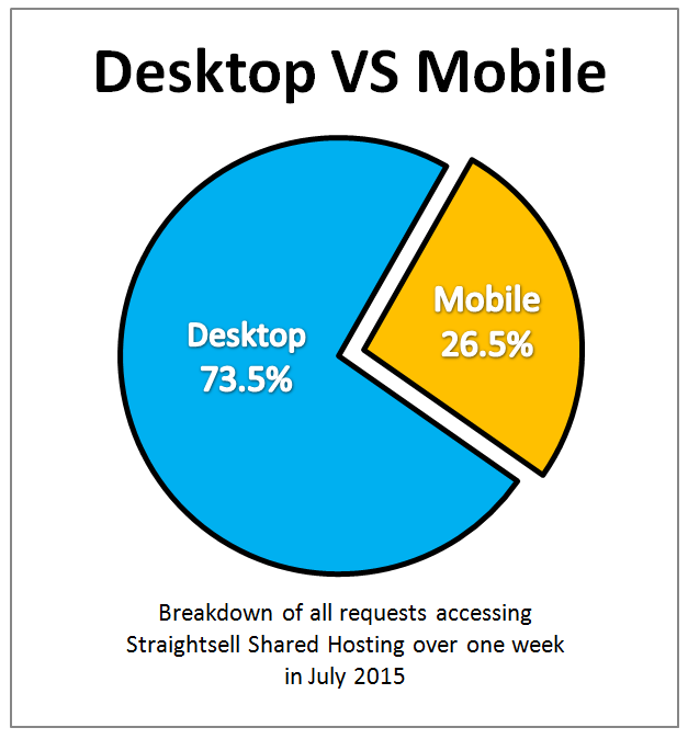
Slightly more than 1 in 4 visits to the Straightsell systems were performed using a mobile device.
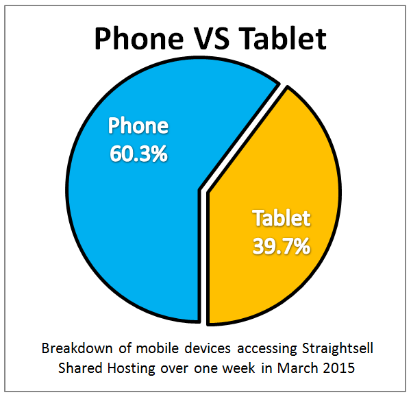
Mobiles are more popular than tablets, and this trend is increasing. In October 2013 the split between Table and Mobile was approximately 50/50, but now it is more than 60% Mobile:
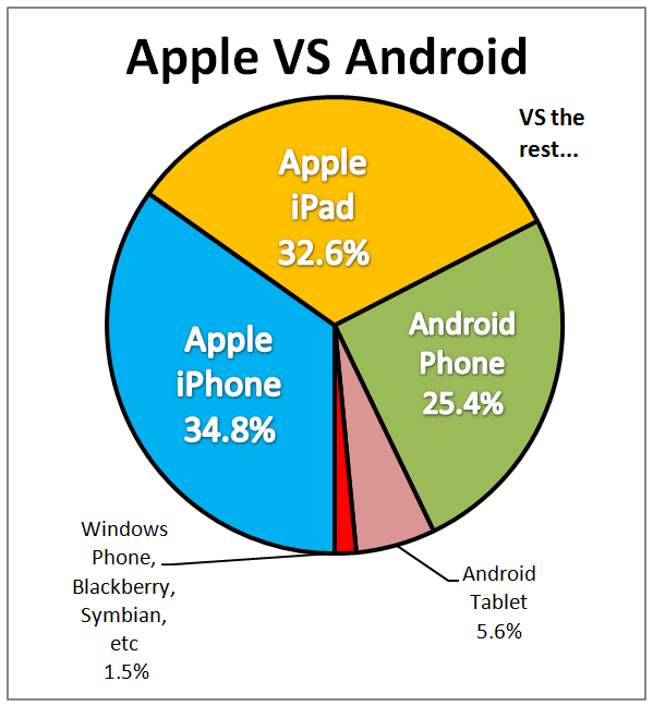
The breakdown of the major mobile platforms (mobile and table combined) is as follows: Apple 67%, Android 31% and Windows, Blackberry etc making up the remainder.